Design Is No Longer Screens: A 7-Phase Design Workflow for Building AI-Native Products 设计不再是画界面:构建 AI 原生产品的 7 步设计流
How to build unique, stable, and scalable products in the era of vibe coding, without losing soul or speed. 在 Vibe Coding 时代,如何在不牺牲灵魂与速度的前提下,构建独特、稳定且可扩展的 AI 原生产品。
- In the AI era, design is decision architecture, not pixel work.
- Unconstrained AI defaults to average; designers must set the boundaries.
- The 7-Phase framework ensures consistency, from intent definition to final polish.
- Use the 20/80 rule: adopt standard infrastructure entirely, customize for true distinction.
- 在 AI 时代,设计不再是画像素,而是决策架构。
- 缺乏约束的 AI 会趋于平庸;设计师必须设定边界。
- 7 步框架确保了产品从意图定义到最终打磨的一致性。
- 运用 20/80 法则:全面采用标准基础设施,把精力放在打造真正的独特性上。
In the whirlwind of AI-native building, where tools like Claude Code or Replit turn prompts into prototypes in minutes, the old design playbook crumbles. We no longer design for developers. We design with AI. That shift changes everything: exploration happens faster, implementation is instant, and drift scales just as quickly if unchecked.
The misconception? “Vibe coding means just describe what you want, and AI builds it.” It sounds magical in demos, but in real products, unconstrained AI defaults to its training average: generic buttons, inconsistent padding, mismatched colors, typography without intent. The result: UIs that look fine in isolation but fall apart side-by-side, functional yet soulless.
The new reality demands a recalibrated role for designers. Not making every decision, but deciding which decisions AI can make. Set the boundaries wrong (too loose, and the output is chaotic slop; too tight, and the process becomes micromanaging with fancier tools) and the whole thing collapses. The art is in the calibration: defining systems that amplify a product’s unique character while ensuring stability, consistency, and scalability.
This workflow addresses that at the root. It’s not rigid steps. It’s adaptive logic, refined across diverse products with varying audiences, aesthetics, and stacks. Products that feel intentional and alive, shipped at velocity without the hangover.
Three Situations, One Logic
Before getting into the framework, one thing needs to be clear: the starting point changes how to use it.
Situation A: An existing product with a mature design system. Someone already did the hard work. Design tokens exist. Components are defined. The job is ensuring new AI-generated features respect the system. The work is execution and extension, not invention. Focus intensively on Phases P3 through P6; the earlier phases are already done.
Situation B: An existing product, but no design system. This is the sneakiest situation because it looks like Situation A from the outside. There are screens. There’s a product. But no one ever extracted the rules from those screens into explicit tokens. The first move is extraction: reverse-engineering the design language already implied in the existing product before building anything new. Otherwise, AI will invent a parallel visual language that fights with the existing one.
Situation C: Building from zero. The most complete version of the workflow. Every phase matters. This is what the full walkthrough covers.
The internal logic connecting all three: A is pure execution. B is extraction, then execution. C is ideation, then extraction, then execution. The emphasis shifts; the underlying structure doesn’t.
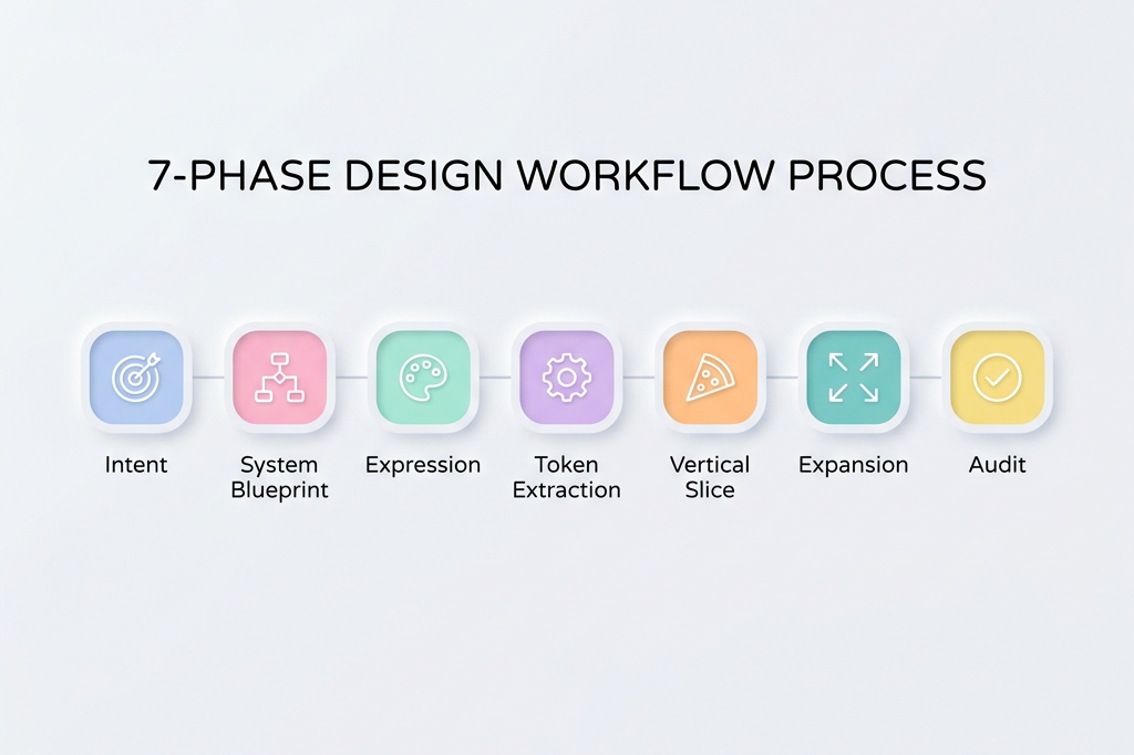
The 7-Phase Framework
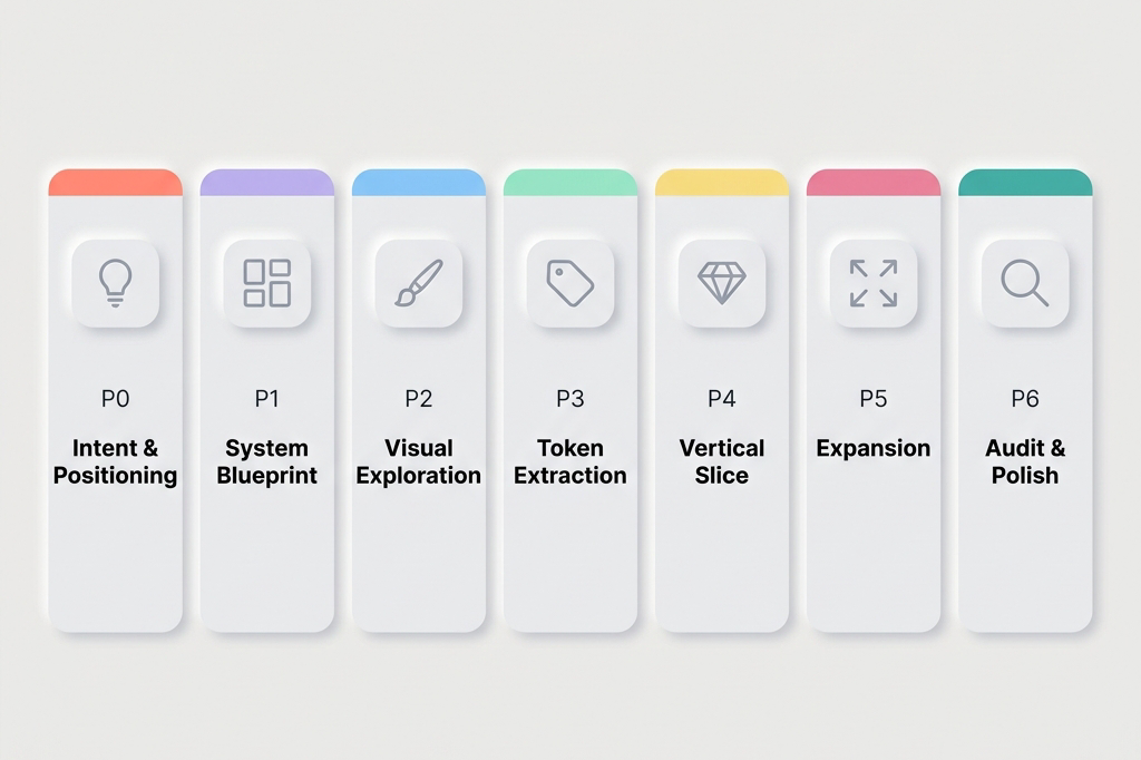
1. P0: Intent & Positioning
What kind of product is this, and what must it never feel like?
This is the phase most designers skip because it doesn’t feel like design work. It feels like strategy. Skipping it is expensive: premature mechanics kill differentiation.
Building before answering “what emotional territory are we claiming?” produces screens that are technically correct and emotionally indistinct. A container with no soul.
The work in P0 is defining the product’s emotional north star in writing. Not a mood board (yet). Words first. Why? Because words force commitment in a way that images don’t. Anyone can collect beautiful images. Fewer people can write a paragraph that says: “This product should feel like the first hour of a Sunday morning: quiet focus, no urgency, a cup of tea. It should never feel like a pop quiz, a leaderboard, or a birthday party.”
That paragraph is worth more to the AI build process than a 20-image mood board, because it can be pasted into every prompt.
Use AI for divergent brainstorming. Ask for five radically different positioning angles. Ask what the anti-version of each looks like. The goal is to pressure-test instincts, not replace them.
Outputs: A single paragraph capturing emotional intent. A short list of keywords the product should embody. An equally short list of things it must never feel like (this negative constraint list is often more useful than the positive one). One sentence defining success qualitatively: “It feels like ___.“
2. P1: System Blueprint
What exists, what flows where, and what cannot break?
Build the skeleton before any visuals touch it.
Here’s the mistake that appears constantly: jumping from “here’s what the product is” to “here’s what it looks like,” skipping the step of figuring out what it does. The complete state model. The edge cases. The invariants.
The result is beautiful screens that don’t compose into a coherent product. A gorgeous onboarding flow that never accounted for returning users. A perfect empty state with no defined trigger.
P1 is where AI serves as a stress-tester, not a generator. Don’t ask AI to design flows. Ask it to break them. “What states does this screen need to handle?” “Where would this logic fail if 10,000 people used it?” “What hasn’t been accounted for?”
This produces something invaluable: a complete list of screens, states, and data requirements before any time is spent on how they look. The blueprint gives expression a reliable canvas instead of a blank page.
Outputs: Flow diagrams. A complete screen inventory with every state named. Interaction contracts (“tapping X always does Y, regardless of state”). And critically: a “what cannot change” list, the invariants all visual decisions must respect.
3. P2: Expression & Visual Exploration
What does this product look like, sound like, feel like?
This is the phase everyone wants to start with. And now, with P0 and P1 done, it’s finally time.
The reason sequencing matters: exploration without constraints produces beautiful things that don’t work. Exploration with constraints produces beautiful things that compose. The starting point isn’t a blank page. It’s filling in a specific shape.
The practical goal is generating 3 to 5 genuinely different visual directions, then choosing one. Not 20 directions. Not 1. The range forces the recognition that a first instinct isn’t the only option; the limit forces commitment.
AI is exceptional at this phase when briefed well. The brief is the P0 intent statement plus the P1 constraints. Give it both. Then ask for contrast: “Show me a direction that’s warm and analog alongside one that’s cool and precise. Show me what happens if you push the typography further. Make one feel more minimal.”
The selection criteria, which most frameworks skip: test each direction against three questions. Does it serve the primary user’s emotional state, not just look good in a portfolio? Does it stay coherent when imagined across 20 screens, not just 3? Does it feel distinct from the closest competitor, not just from bad design?
Pick one. Commit to it publicly in the project documentation, so there’s no quietly drifting back to the others.
Outputs: 3 to 5 visual directions, each shown across 2 to 3 representative screens. One selected hero direction. Initial hero screens that will become the reference artifacts for everything downstream.
4. P3: Token Extraction & Spec Definition
Convert vibe into logic.
This is where the magic becomes math.
There’s a chosen visual direction. It looks right. But “looks right” is not a specification. Handing AI “looks right” and expecting consistent results across 30 screens will fail.
Token extraction is the bridge between expression and maintainability. The process translates every decision in the hero screens into an explicit, named rule. Not “the cards are kind of rounded” but border-radius: 12px. Not “the text feels light and airy” but line-height: 1.7, font-weight: 400, letter-spacing: 0.02em.
The practical format: a constraints file. Plain text or markdown. Named tokens only; no raw hex values or arbitrary pixel numbers in component code. Every color gets a semantic name (color-primary, color-surface, color-feedback-correct). Every spacing value gets a token name (space-md: 16px). Every component gets a written spec covering appearance, sizing, states, and, critically, what it must never do.
That last part is disproportionately important. Negative constraints work better than positive ones with AI. “Primary button: 52px height, solid fill, color-primary background” is good. Adding “Never use a gradient. Never appear more than once per screen. Never float without a resting surface below it” is what makes the rule binding.
AI can do much of this extraction work. The most reliable method is MCP, which gives the model direct access to a Figma design repository. Without MCP, Figma’s “copy as code” feature provides the next best source of truth. If neither is available, screenshots work as a fallback: show AI the screens, then verify that the extracted tokens accurately reflect the actual design decisions.
Outputs: A constraints file. A small set of Figma components for the 6 to 8 most-used UI elements, built as real Figma components (not static frames). These become the reference artifacts for all future AI build prompts.
5. P4: Vertical Slice
Does it actually hold together?
Before building everything, build one complete thing.
Pick the most critical user flow, from entry to completion: the daily learning loop, the checkout flow, the onboarding sequence. Build the entire thing, end to end, using the blueprint and the tokens.
This phase exists to find the blind spots that look invisible on paper but become obvious in practice. Does the visual language that felt right on hero screens hold up under the repetition of a real session? Does the card component that looked clean in isolation feel cluttered when it contains real content? Does the spacing system that felt generous on an empty screen feel cramped when the UI is fully populated?
The key discipline here is the Hybrid Rule: if something feels visually wrong, don’t just fix the screen. Pause. Re-enter expressive mode fully, exploring the fix as if it were a new design decision. Validate the solution. Then immediately update the tokens and spec. Never patch visually without a system update. A patched screen and an unchanged spec creates invisible inconsistency that multiplies across every screen built afterward.
This is where most drift starts. The vertical slice is specifically designed to surface it early, while the cost of fixing it is still low.
Outputs: One fully functional, coherent end-to-end flow. Updated tokens and spec reflecting any adjustments made during the slice. Confidence that the system is real, not theoretical.
6. P5: Expansion
Scale without drift.
Now build everything else.
With a validated vertical slice, a constraints file, and a set of Figma components, AI can generate screens with real consistency. The work becomes methodical: apply the system to each remaining screen and flow.
The prompt style changes fundamentally here. In P2, prompts were loose and comparative (“show me 5 directions”). In P5, they’re locked and specific: “Build the settings screen using only the defined tokens. The layout follows the pattern established in [reference screen]. Here is the wireframe [attach]. Here is the constraints file [attach]. Do not introduce any new visual patterns.”
The golden rule for P5: if there’s an urge to make a one-off aesthetic tweak, that’s a signal the system is incomplete, not that the screen needs a special exception. Stop. Go back to P3. Strengthen the token. Then build the screen. A system that requires exceptions is a system that’s about to drift.
Outputs: Complete, consistent product flows. A deviations log documenting any gap between what was intended and what AI produced that was accepted. This log will be essential in P6.
7. P6: Audit, Refine & Polished
Ruthless quality control and the final 10% that makes the difference.
This phase separates products that feel finished from products that feel almost done.
The work is diagnostic first: where is the visual rhythm inconsistent? Where does the density feel wrong (too sparse in some places, too crowded in others)? Where are the accessibility gaps that weren’t visible until everything was assembled? Where did content drift from the tone established in P0?
Use AI as an auditor here, not just a builder. “Compare these six screens. Where is spacing inconsistent? Where does the typography hierarchy break down? What three things feel most off?” Then fix surgically. Every expressive refinement must end with a system lock-in: if it’s not in the updated spec, it doesn’t ship.
Throughout this phase, one discipline matters: know whether each revision is local (a one-time visual adjustment) or systemic (a rule that should apply everywhere). For systemic revisions, tell AI explicitly: “This is a system-level change. Update the design token.”
The last 10% is also where soul-lifting touches arrive: micro-interactions that make the product feel alive, copy that sounds like a human wrote it for a specific person, transitions that give weight and physicality to state changes. These are small, but they’re felt. They’re the difference between “this works” and “I want to use this.”
Outputs: A polished, shippable product. An updated, battle-tested constraints file reflecting the real implemented system. A clean deviations log for the next iteration.
The 20/80 Rule: Why Not Everything Needs to Be Built from Scratch
This framework looks like a lot of work. And for P0 through P3 especially, the question will arise: does every token, every component, every constraint really need to be defined from scratch?
No. And working as if they do means working too hard.
The 20/80 principle of vibe coding design: 80% of what makes a product solid is infrastructure that should be adopted wholesale. 20% is expression that makes it distinctive.
Think of it like renovating a house. The plumbing doesn’t get redesigned. The electrical system doesn’t get re-engineered. Work happens on the walls, the furniture, the light: the things people actually experience. A good UI kit is the plumbing. Accessibility, touch targets, interaction patterns, responsive behavior, animation timing, component architecture. These represent decades of refinement and user research. Adopting them wholesale is not a shortcut. It’s good judgment.
What to adopt unchanged:
- Touch target sizing (minimum 44×44pt on iOS, 48×48dp on Android)
- Safe area insets and margin conventions
- Standard gesture patterns (swipe, long press, pull-to-refresh)
- Accessibility standards (color contrast ratios, screen reader behavior)
- Established interaction timing (transitions, feedback delays)
- Responsive layout logic within platform conventions
What to customize:
- Color system (full ownership: this is where brand lives)
- Typography choice and scale (typeface selection, weight distribution, spacing)
- Shape language (border radius values, card elevation, shadow depth)
- Iconography style (filled vs. outlined, weight, corner rounding)
- Motion personality (spring physics, duration preferences, easing character)
- Information density (how much shows on each surface)
What to add on top for genuine distinction:
- Brand moments: places where the visual identity speaks directly (onboarding, celebration states, empty states)
- Voice and copy: the most underrated design element in any digital product
- Character-specific details: custom illustrations, unique empty states, personality in microcopy
- Signature interactions: one or two animations or transitions that feel unmistakably the product’s own
Material 3 and Apple’s HIG are excellent starting points precisely because they already encode the infrastructure layer. Choosing either as a foundation isn’t a limitation. It’s freedom to spend design energy on the 20% that actually makes a product distinctive.
The Real Shift: From Screens to Systems
In the AI era, the work has fundamentally reframed.
The designer’s job is no longer screens. It’s constraints.
AI can generate 50 screens in minutes. It can generate versions of any design artifact. What it cannot do is know when it’s gotten them wrong.
That’s the work.
Design is no longer pixel work. Design is decision architecture.
In the AI era, creativity without structure becomes noise. Structure without creativity becomes generic.
Design has always been about constraint. Every medium has its material limits: wood grain, screen resolution, human attention spans. Great designers don’t fight their constraints. They use them.
AI changes what the constraints are, not whether they exist. The new constraint is this: AI will fill every vacuum left to it with its best guess, and its best guess is the visual average of everything it has seen before. The job is to leave fewer vacuums.
The framework above is a system for leaving fewer vacuums. For making more decisions before the build starts rather than after. For converting taste into rules that travel across tools, across sessions, and across the entire surface area of a product.
Because in the end, design is about anchoring to one specific possibility among thousands. It’s about knowing which decisions are worth making, which to delegate, and how to make delegation precise enough that the outcome is still recognizably the designer’s own.
That’s the skill. It’s always been the skill. AI just made it visible.
在 AI 原生构建的热潮中,工具能在几分钟内将提示词变成原型,过去的设计剧本完全失效了。我们不再是为开发者设计,我们是在与 AI 一起设计。这种转变改变了一切:探索变得更快,实现是即时的,而如果不加约束,设计的偏离也会同样迅速地被放大。
常见的误解是:“Vibe coding 意味着你只要描述出你想要的,AI 就能建出来。” 这在演示里听起来很神奇,但在真实的产品里,不受约束的 AI 会退回到它训练数据的平均值:通用的按钮、不一致的边距、不搭调的颜色、缺乏意图的排版。结果是:这些界面单独看都不错,但放在一起就分崩离析,功能完备却缺乏灵魂。
新的现实要求设计师重新校准自己的角色。不是做每一个决定,而是决定 AI 可以做哪些决定。如果边界设定错了(太宽,产出就是混乱的一锅粥;太紧,过程就变成了用更高级的工具进行微观管理),整个过程就会崩溃。这门艺术在于校准:定义一系列系统,既能放大产品独特的内核,又能保证其稳定性、一致性和可扩展性。
这个工作流从根本上解决这个问题。它不是僵化的步骤,它是一种自适应的逻辑,已经在不同产品的验证中打磨成型。它能帮你以极高的速度交付感觉有意图且有生命力的产品。
三种情境,一套逻辑
在深入框架之前,有一件事必须明确:起点的不同会改变你使用它的方式。
情境 A: 一个有着成熟设计系统的现有产品。有人已经做完了最辛苦的工作。Design tokens 已存在。组件已定义。现在的工作是确保新的 AI 生成功能尊重这套系统。这是关于执行和扩展,而不是发明。将重点集中在 P3 到 P6 阶段。
情境 B: 现有产品,但没有设计系统。这是最容易让人掉坑的情况,因为从外面看它很像情境 A。有界面,有产品。但是从来没有人把这些界面里隐含的规则提取成明确的 tokens。第一步是提取:在构建任何新东西之前,对现有产品中隐含的设计语言进行逆向工程。否则,AI 会发明出一套平行的视觉语言,与现有的系统打架。
情境 C: 从零开始。这是工作流最完整的版本,每一个阶段都很重要。
连接这三种情境的内在逻辑是:A 纯粹是执行。B 是提取,然后执行。C 是构思,然后提取,然后执行。虽然重心在变,但底层结构是不变的。
7 步框架
1. P0:意图与定位 (Intent & Positioning)
这是个什么感觉的产品?它绝对不能给人什么感觉?
这是大多数设计师跳过的一步,因为它感觉不像是在做设计,而像是在做战略。跳过它的代价很昂贵:过早陷入细节会扼杀独特性。
在回答“我们在占领哪个情感领地?”之前就开始胡建,会做出技术上正确但情感上模糊的界面。一个没有灵魂的容器。
P0 阶段的工作是用文字写下产品的情感北极星。不是去找情绪板(还没到时候)。先用文字。为什么?因为文字会迫使你做出承诺,而图片做不到。任何人都能收集一推好看的图片,但很少有人能写出这样一段话:“这个产品应该感觉像周日上午的第一个小时:安静专注,没有紧迫感,一杯热茶。它绝不应该给人一种突击考试、排行榜冲刺或者生日派对的感觉。”
这一段话对 AI 的价值胜过 20 张图片的情绪板,因为它可以直接被放到提示词里。
利用 AI 来做发散式脑暴。要求它给出五个截然不同的定位角度。问问它每一个的“反面”是什么。目标是压力测试直觉,而不是替代它。
输出成果: 一段捕捉情感意图的话。一个产品必须具象化的简短关键词列表。一个“它绝不应有的感觉”列表(负向约束往往比正向的更有用)。一句感性定义成功的句子:“它感觉像___。”
2. P1:系统蓝图 (System Blueprint)
有什么内容?流程是怎么走的?什么东西绝对不能出错?
在把任何视觉效果挂上去之前,先搭好骨架。
这里经常出现的一个错误:直接从“这个产品是干嘛的”跳到“它长什么样”,跳过了“它到底怎么运作”这一步。完整的状态模型、边缘情况、那些不变量 (Invariants)。
结果就是做出很多漂亮却拼凑不成一个连贯产品的界面。比如华丽的新手引导,却忘了考虑老用户;完美的空状态,却弄不清触发条件。
在 P1,AI 是一个压力测试仪,而不是生成器。不要让 AI 设计流,让它来“找茬”。“这个页面需要处理哪些状态?”“如果一万人同时用,这个逻辑会在哪崩掉?”
蓝图为视觉表达提供的是可靠的画卷,而不是空白页。
输出成果: 流程图。一份完整的屏幕及所有状态命名的清单。交互契约(比如“点 X 永远会产生 Y 结果”)。以及最关键的:“不可变清单”——所有视觉决策都必须尊重的不变量。
3. P2:视觉表达与探索 (Expression & Visual Exploration)
这个产品看起来、听起来、感觉起来是什么样的?
所有人最期待的就是这一步。有了 P0 和 P1 打底,现在终于到处发挥创意的时候了。
时序之所以重要,原因在此:没有约束的探索会产生中看不中用的半成品。有约束的探索产生的是美丽且能组合复用的模块。
目标是生成 3 到 5 个真正不同的视觉方向,然后选其一。如果简报清晰,AI 在这个阶段表现卓越。简报就是 P0 意图声明加上 P1 约束条件。
用三个问题测试每个方向:它服务于核心用户的情感状态吗?当它铺开在 20 个页面上时,它还能保持连贯吗?它与最接近的竞品有明显区别吗?
选定一个,并在项目文档里公开承诺它。
输出成果: 3 至 5 个视觉方向。选定一个“英雄 (Hero)”方向。这些初步的 Hero 界面将成为下游所有工作的参考标准。
4. P3:Token 提取与规范定义 (Token Extraction & Spec Definition)
把 Vibe 翻译成逻辑。
这是魔法变成数学的地方。
你选定了一个视觉方向。它看起来对了。但是“看起来对”并不是一种技术规格。你把“看起来对”丢给 AI 并期望它在 30 个页面间保持一致结果,必然会翻车。
Token 提取是连接表达和可维护性设计的桥梁。这个过程意味着将 Hero 屏幕里的每一次决策转化成一项具体的、命名的规则。不仅是“卡片圆润”,而是 border-radius: 12px。
实际形式是:约束文件 (Constraints file)。纯文本或 Markdown 即可。纯用 Token 名字,不用具体像素值。每个组件都有文字描写,涵盖功能与约束。
负向约束对于 AI 来说比正向指导管用。比如在此加上“绝不可使用渐变色;绝不浮空”,这条规则才会坚不可摧。MCP 或者 Figma 的 “copy as code” 是很棒的工具。
输出成果: 一份约束文件。由最常用的 UI 元素组成的微型组件集合。它们是未来提示词的参照物。
5. P4:垂直切片 (Vertical Slice)
这玩意究竟立不立得住?
在建全套之前,先做一件完整的事。
挑选最核心的一个用户流程,彻底从头到尾把它搞出来。本环节存在的意义是抓取那些在纸面上无形但在长链路中会一览无余的错误。
重中之重是要遵守“混合法则”:当一个东西“看起来不对”时,不能只在单一页面打补丁。暂停。重新进行体验重塑设计。如果这把修复起效了,马上更新回到你的 Token 里!未更新准则的情况就去做的单一画面修补会引来全盘的隐形灾难。
垂直切片是在系统偏差最轻的时候就把问题一网打尽的过滤器。
输出成果: 一整套逻辑闭环并能运行的核心链路。矫正过的规则与 tokens。彻底确信我们构建出来的是现实体系、而不是空中楼阁。
6. P5:扩张与蔓延 (Expansion)
零偏移的无限放缩。
开始搞剩下所有的东西。
手里攥着验证完毕的垂直切片、规则库和数个基体组件,AI 从此便具备造出完全稳健屏幕的本事。接下的工作变得按部就班。
在这个节骨眼里假如又出现了临时加个小补丁的想法——这是一个红色警告你的系统漏气了(残缺)。这不代表你在为一个单一特例放绿灯。立刻终止,回溯到 P3 阶段,强化巩固 token 法则,然后继续。
输出成果: 一套无缝连接的产品屏幕。以及在对抗生成时所权衡及做出的例外妥协偏差记录单 (deviations log)。
7. P6:全盘核验、细修与抛光打磨 (Audit, Refine & Polished)
用严苛的把控拔高最后百分之十。
这一层是将“完工”与“卓越”划分的地方。
找寻不一致的视觉跨度,填补空洞。用 AI 当挑错官:“这六张图哪里边距不同?有什么明显的三大不搭调?” 随后的处理动作必须如外科手术刀一样精确介入。
这里的 1/10 是为了赋予体验以血肉的。微小的转场效果、极具人性化的词汇副本,这些点滴确切地将“还能凑合”变成了“不可或缺”。
输出成果: 一份足以经得起推敲甚至可即刻上线的最终产品。随时在后台护卫的一份新版本法则更新约束表。
20/80 法则:为何不要也不必让每一寸砖块全都自力更生
如果遇到 P0 到 P3,每一个要求都重新从零手工设定的话,说明你完全用错了力气。
Vibe coding 下设计的 20/80 的分界定律:成就一个基石坚固产品的 80% 因素来自于无需废话全盘继承照搬硬抄那已经固化好作为基建沉淀。但是,成就独特性脱颖而出则在于你把剩下来区区的 20% 个性挥洒殆尽用到极致与刀尖。
比如一套久经验证的 UI 库,以及触碰响应面积、防割手安全距、可访问性标尺、以及惯见平滑的延迟物理缓冲——这些代表数十年百炼千锤的公共智慧。拥抱他们才是理智。
什么去直接做照抄采纳:
- 触摸安全区与响应标准界定
- 无障碍和色盲冲突阈值保护
- 惯用手势如滑切与拉力
- 互动和界面伸缩反馈滞后公约
去发力与重塑自己的个性点(那 20%):
- 色彩系统与矩阵(在这里完全表达并宣誓你的归属定位与个性声音)
- 独特的字体体系尺寸和版式
- 特效及切角视觉元素面貌
- 组件内部插画基调及留空状态下品牌展现
- 特殊物理碰撞以及专门预调转场回场“杀手锏”效应
以 Material 3 或是 Apple HIG 为起手牌,反而是解开所有杂务的枷锁,全权为你留出时间和脑力去完成那真正卓越的 20%。
真正的跃升:由屏幕到系统
在 AI 引领的纪元,工作性质已经大换血。
设计师的权杖不再是如何绘制界面的每一个元素。它是布设与落锁“约束”。
设计不再是一张张画屏,它是“决策的体系结构”。
在 AI 时代,缺乏结构的创意会沦为噪音;而缺乏创意的结构只产出平庸而已。
设计本来就是一门在局限与限制当中闪转腾挪的艺术。AI 时代的本质并未抹灭这种极限原则;相反,它只变更了你应对它们时使用的边界参数工具罢了。 倘使你遗留一寸未能被制约规则所镇守住的留白空地,AI 必然会调动全球所有普通作品中最为平庸均一的那一款所谓“中庸安全”之法宝将那里平地起平楼地给胡乱铺满……而你的天命职权所在,恰恰就在“不让它钻出半寸这样的空地”。
这个体系是一整套帮我们前置预埋防线并将那些模糊捉摸不定的品味与眼界强制进行代码逻辑归档与落地沉淀的基础。归根结底,做决定、确立那唯一独钟且值得执行的真理并赋予约束去限制他人为代劳之限度——确保交付出的终端杰作不管怎样都烙铁一般烫深写上着属于创立者名字和调调。这也是手艺,这就是技能本尊。
过去它潜伏于底层,现在终于无所遁形地跃至了台前!